How to Build a Provider Dashboard for Remote Vitals
A health IT analysis of how to build a provider dashboard for remote vitals, covering alert design, FHIR workflows, and dashboard architecture for RPM teams.
How to Build a Provider Dashboard for Remote Vitals
Any team trying to build a provider dashboard for remote vitals eventually runs into the same problem: collecting readings is easy compared with making them clinically usable. Remote blood pressure, pulse, oxygen saturation, weight, and symptom data can arrive all day, but a dashboard that simply piles those readings onto one screen does not help a nurse, physician, or telehealth operator decide what matters now.
“RPM interventions require data collection, transmission, evaluation, and information presentation working together rather than as isolated tools.” — Jennifer Claggett, Stacie Petter, Amol Joshi, Todd Ponzio, and Eric Kirkendall, Journal of Medical Internet Research (2024)
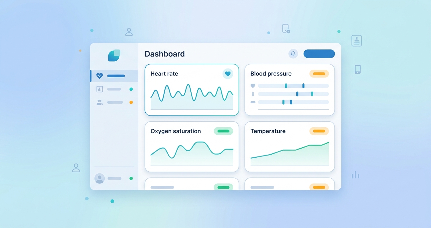
Build Provider Dashboard Remote Vitals Around Clinical Triage, Not Raw Data
That is the real design principle. A provider dashboard for remote vitals is not a reporting page. It is a triage surface. Jennifer Claggett and colleagues at Cincinnati Children's described remote patient monitoring infrastructure as a chain of connected functions, from data capture through presentation and follow-up. Their 2024 framework is useful because it treats the dashboard as the last mile of a larger operational system, not the whole system by itself.
In practice, most RPM dashboards need five layers:
- A device or capture layer that gathers readings from cuffs, scales, pulse oximeters, apps, or contactless workflows
- A normalization layer that timestamps, validates, and maps readings into usable clinical fields
- A rules layer that identifies threshold breaches, trends, and missing data
- A presentation layer that sorts patients by urgency rather than arrival time
- A workflow layer that turns findings into documented outreach, escalation, or chart updates
If one of those layers is weak, the dashboard usually becomes noisy fast. That is why dashboard projects often fail for workflow reasons rather than interface reasons.
| Dashboard element | What it should show | What goes wrong when it is missing |
|---|---|---|
| Patient priority list | Ranked queue by risk, not alphabetically | Staff scan hundreds of normal readings to find one unstable patient |
| Trend view | Multi-day change in vitals and adherence | Teams react to isolated values without context |
| Alert status | New, acknowledged, escalated, resolved | Duplicate outreach and unclear ownership |
| Integration context | Encounter, diagnosis, care plan, recent meds | Readings arrive without clinical meaning |
| Documentation handoff | Note, task, or EHR write-back path | Staff must re-enter findings in another system |
Why the Dashboard Architecture Matters More Than the Widget Set
A lot of dashboard discussions drift into visual design. Colors matter. Chart choices matter. Still, the harder question is architectural: where should the clinical logic live?
Some health systems place threshold logic inside the RPM platform and use the dashboard to display already-ranked work. Others use an integration engine or analytics layer to combine remote vitals with EHR context before tasks appear. The HL7 Personal Health Device Implementation Guide frames this as a patient-generated data workflow problem. The point is simple: once home readings enter the clinical stack, they have to be standardized, attributable, and routed with enough context for a safe decision.
That is especially important for remote vitals because the same number can mean different things in different programs. A mildly elevated heart rate in post-discharge follow-up is not handled the same way as the same reading in oncology symptom monitoring or heart failure surveillance.
For that reason, strong dashboard designs usually separate three views:
- Population view: which patients need review first
- Patient view: what changed, over what period, and whether the pattern is credible
- Action view: who owns follow-up and whether that action made it back into the record
I keep coming back to that last point because it is where many builds get stuck. If the dashboard cannot close the loop into existing documentation and messaging workflows, it becomes one more screen clinicians tolerate rather than use.
Industry Applications for Remote Vitals Dashboards
Health system RPM command centers
Large RPM programs need a queue that behaves more like air-traffic control than a chart browser. Health IT teams usually care about panel prioritization, staffing load, and escalation timing more than flashy data visuals. A provider dashboard in this setting should show which patients are newly unstable, which alerts are aging without response, and which programs are generating unusual alert volume.
Virtual care and telehealth operations
Telehealth teams often need a lighter-weight dashboard that can pull remote vitals into visit preparation. In this model, the dashboard does not replace the visit note. It gives the clinician a quick read on baseline values, short-term trend direction, and whether a reading should be repeated during the encounter.
EHR integration teams
For integration leaders, the dashboard is often the visible output of a larger interoperability project. The real work involves mapping vital-sign observations, provenance, device identity, timestamps, and routing rules into standards the EHR can accept. That is why FHIR support matters less as a marketing phrase and more as an operational requirement.
Care management and transitional care
This may be the most practical use case. Transitional care teams need a clear answer to a boring but crucial question: which patients need outreach this morning? A usable remote-vitals dashboard surfaces deterioration patterns, nonadherence, and unresolved alerts without forcing staff to dig through each patient one by one.
Current Research and Evidence
The evidence base around RPM workflow design is getting more concrete. In a 2023 systematic review published in The Permanente Journal, Luis Serrano and colleagues found that clinicians consistently saw value in remote monitoring for earlier intervention and continuity of care, but they also reported recurring challenges around workflow burden, technical reliability, and data overload. That is probably the most honest summary of the dashboard problem: the data can help, but only if the presentation layer keeps pace with the monitoring layer.
Claggett, Petter, Joshi, Ponzio, and Kirkendall pushed the conversation further in 2024 by breaking RPM infrastructure into connected operational components. Their framework is useful for dashboard builders because it makes information presentation a formal part of the intervention rather than an afterthought. In other words, a poor dashboard is not a cosmetic flaw. It is an infrastructure flaw.
Standards groups are shaping the design too. HL7's Personal Health Device Implementation Guide for remote patient monitoring emphasizes structured patient-generated data, device-to-gateway transport, and downstream clinical use. That guidance matters because dashboards are increasingly expected to sit inside hybrid architectures where some data stays in the monitoring platform while key observations and alerts write back into the EHR.
There is also a market signal here. A 2024 industry roundup from Medical Technology reported that clinician use of remote patient monitoring had risen sharply over the prior two years, while reimbursement support from CMS remained in place. More adoption means more data, and more data means the provider dashboard stops being optional. It becomes the operating surface for the whole program.
The Future of Remote Vitals Dashboards
The next generation of provider dashboards will probably look less like static monitoring portals and more like workflow orchestration systems.
First, dashboards will become more context-aware. A remote oxygen reading will be interpreted differently depending on diagnosis, care pathway, recent medication changes, and prior escalation history.
Second, teams will expect better queue intelligence. That does not have to mean black-box AI. Often it just means ranking work by trend severity, adherence gaps, and time since last review instead of by the time a reading landed.
Third, interoperability will tighten. More organizations will want dashboards that can consume FHIR observations, publish tasks, and return resolved actions to the longitudinal record. That reduces the familiar problem of nurses working from one dashboard while physicians document in another system.
Finally, the best dashboards will probably get simpler, not busier. Remote monitoring has a habit of accumulating charts, filters, and warning banners until nobody can see the signal. Mature teams usually move the other direction. They strip the interface down to the decisions that actually need a person.
Frequently Asked Questions
What is the main goal of a provider dashboard for remote vitals?
The main goal is to help clinicians and operations teams identify which patients need attention, why they need it, and who owns the next step. It is a triage and workflow tool, not just a data display.
Should remote vitals dashboards live inside the EHR?
Sometimes, but not always. Many organizations use a dedicated RPM dashboard for queue management and then write selected observations, alerts, or summaries back into the EHR. The right model depends on staffing, governance, and integration maturity.
What data should appear first on the dashboard?
Priority status, trend direction, unresolved alerts, and recent adherence are usually more useful than a long list of individual readings. Clinicians generally need context before detail.
Why do remote-vitals dashboards create alert fatigue?
They create alert fatigue when threshold logic is too blunt, when every abnormal reading is treated the same, or when the system cannot distinguish a transient outlier from a meaningful trend. Better ranking and better clinical context usually matter more than adding more alerts.
Teams working through provider dashboard architecture for remote monitoring usually end up asking the same bigger question: how should remote vitals flow into the systems clinicians already trust? That is exactly where standards-based telehealth integration work is heading. For a broader look, see Circadify's telehealth integration approach, along with related posts on RPM data workflow from patient scan to provider dashboard and interoperability standards for remote monitoring data.